Merit Medical Rebrand
MERIT MEDICAL REBRAND
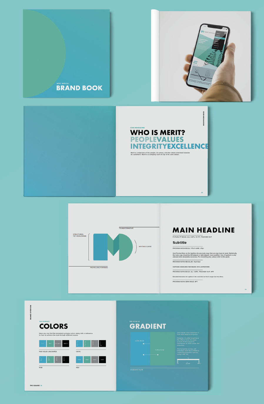
Merit Medical is a medical equipment provider based in South Jordan, UT, that was founded in 1987. Their current branding utilizes the colors red, black, and white. While red and black are powerful color combinations, its strong correlation to the idea of ‘blood’ and ‘death’ in a medical setting makes it less than desirable. Almost all of Merit Medical’s competitors used either a mix of Indigo Blue or Azure Blue.
In order to combine the feel of their current branding as well as meet the feeling of a medical company, I decided to use the color teal, a warmer and more welcoming hue. The contrast of teal with black and white creates a more modern feel for the brand.

Mock stationery done for the Merit Medical rebrand.